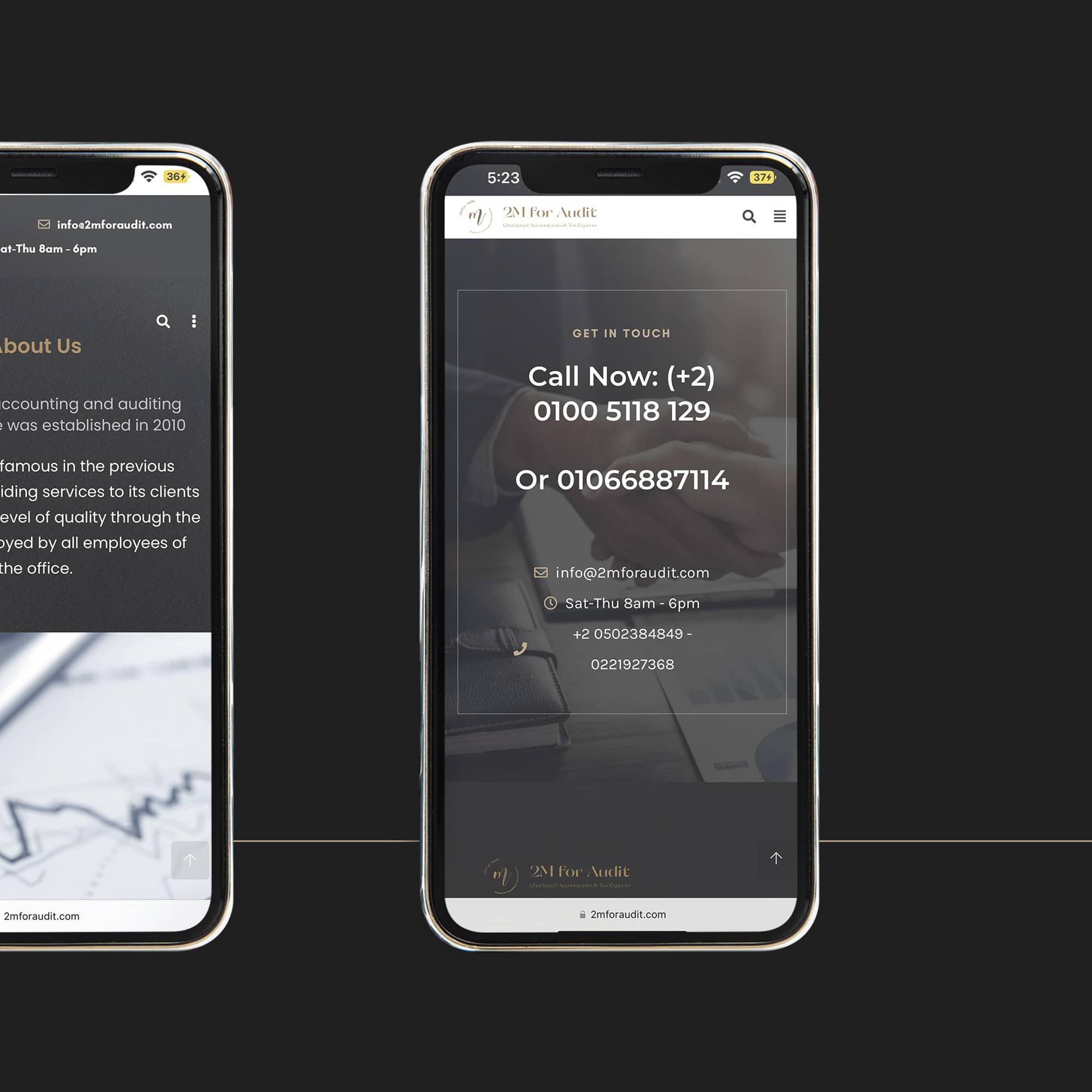
Website UI/UX – 2M Chartered Accountants & Tax Experts
2M website was designed by Let Me In Branding Studio to be elegant and easy to use. It features a smooth interface with their branding identity, as well as call to action buttons that are easy to understand. The website is very easy to navigate, and it has a good balance between images and text. There are also some animations that add an extra touch to the overall design of the page.
It has been adopted by more than 800k people, who use it to find tax and accounting information.
In Addition it is designed to be compatible with the mobile and desktop versions of the internet browser. It also has a responsive design, which makes it easier for people to navigate the site using their smartphones or tablets.


